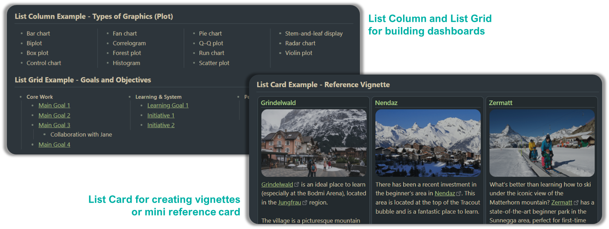
List Column
Table of Contents
Overview
List Column layout will allow you to create multi column layout using unordered lists (i.e. - list item). There are 3 different ways you can do so using MCL snippets i.e.
- Apply at the specific list block using hashtag. This is the recommended option.
- Apply at the specific list block using Markdown Attributes plugin.
- Apply at the frontmatter. This affects ALL unordered list in that particular note
Making it work in Live Preview
The column layout will only work on Reading View. If you want to make it work on Live Preview, there are a few options. You can encapsulate the list block in MCL’s
[blank-container]callout
Using hashtag i.e. #mcl/list-column
- This option require your Obsidian to be installed with installer version 1.1.9 or higher (note that there are installer and app versions).
- Place the tag anywhere in the top-level list items (preferably in the first bullet for easy identification). If you have consecutive group of list that you actually meant to be a separate lists, ensure to properly “break” it by placing either a header, horizontal line or
<br/>tag in between
Here’s an example markdown:
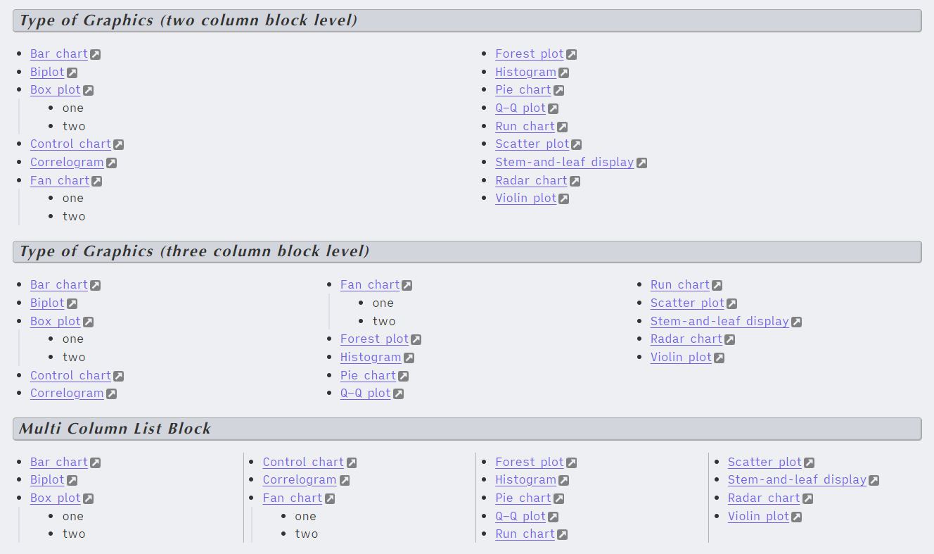
- list item 1 #mcl/list-column
- list item 2
- list item 3
	- sub list 3-1
	- sub list 3-2
- list item 4
- list item 5
	- sub list 5-1
- list item 6
Using this option, the number of columns or grids or cards is determined by minimum width (adjustable using Style Settings plugin), available note/page width and how many bullets. Under default settings, normal page layout can fit 3 columns/grids/cards but if there’s only two bullets, it will expand to fill the space.
Using Markdown Attributes plugin
Using this approach will require Markdown Attributes plugin. Read the plugin documentation where to put the CSS class (typically at the end of the block). MCL provides the following CSS classes
{.two-column-list-block}{.three-column-list-block}{.four-column-list-block}{.multi-column-list-block}- number of columns depend of note’s width and MCL settings on minimum width (default is 200px)
For this approach, do note that there’s a dot (.) before the class name. This is following how CSS classes are referred in CSS file.
Here’s an example markdown:
---
cssClass: two-column-list
---

- list item 1 #mcl/list-column
- list item 2
- list item 3
	- sub list 3-1
	- sub list 3-2
- list item 4
- list item 5
	- sub list 5-1
- list item 6
{ .two-column-list-block }
By default, there’s a column ruler (vertical guide line). You may disable it via Style Settings
Note that this approach do not work well if the last bullet is indented (not part of top level list). Example here
---
cssClass: two-column-list
---

- list item 1 #mcl/list-column
- list item 2
- list item 3
	- sub list 3-1
	- sub list 3-2
{ .two-column-list-block }
Using frontmatter declaration
Using this approach, you will have to specify the css for the column type at the frontmatter (it must be located at the very top of your document, wrapped by two sets of 3 dashes i.e. ---, see example below for better understanding). MCL provides the following CSS classes
two-column-listthree-column-listfour-column-listmulti-column-list
Here’s an example markdown:
---
cssClass: two-column-list
---

- list item 1 #mcl/list-column
- list item 2
- list item 3
	- sub list 3-1
	- sub list 3-2
- list item 4
- list item 5
	- sub list 5-1
- list item 6
Example