List Card
Table of Contents
Overview
List Card layout will allow you to create multi column and multi row layout using a combination of (a) unordered lists (i.e. - list item) and (b) custom hashtag at the specific list block.
Making it work in Live Preview
The column layout will only work on Reading View. If you want to make it work on Live Preview, there are a few options. You can encapsulate the list block in MCL’s
[blank-container]callout…
There’s no Markdown Attributes plugin approach
There are no Markdown Attributes approach due to limitation in specifying at the end of list block
How to Use #mcl/list-card
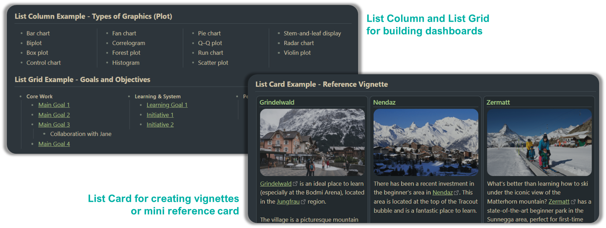
Technically List Card is quite similar to List Grid but with extra customisation to make it card like. In order to enable it, place the hashtag anywhere in the top-level list items (preferably in the first bullet for easy identification). There are two options for List Card i.e.
#mcl/list-card- default minimum width 250px#mcl/list-card-wide- default minimum width 350px
If you have consecutive group of list that you actually meant to be a separate lists, ensure to properly “break” it by placing either a header, horizontal line or <br/> tag in between
This option require your Obsidian to be installed with installer version 1.1.9 or higher (note that there are installer and app versions).
Here’s an example markdown:
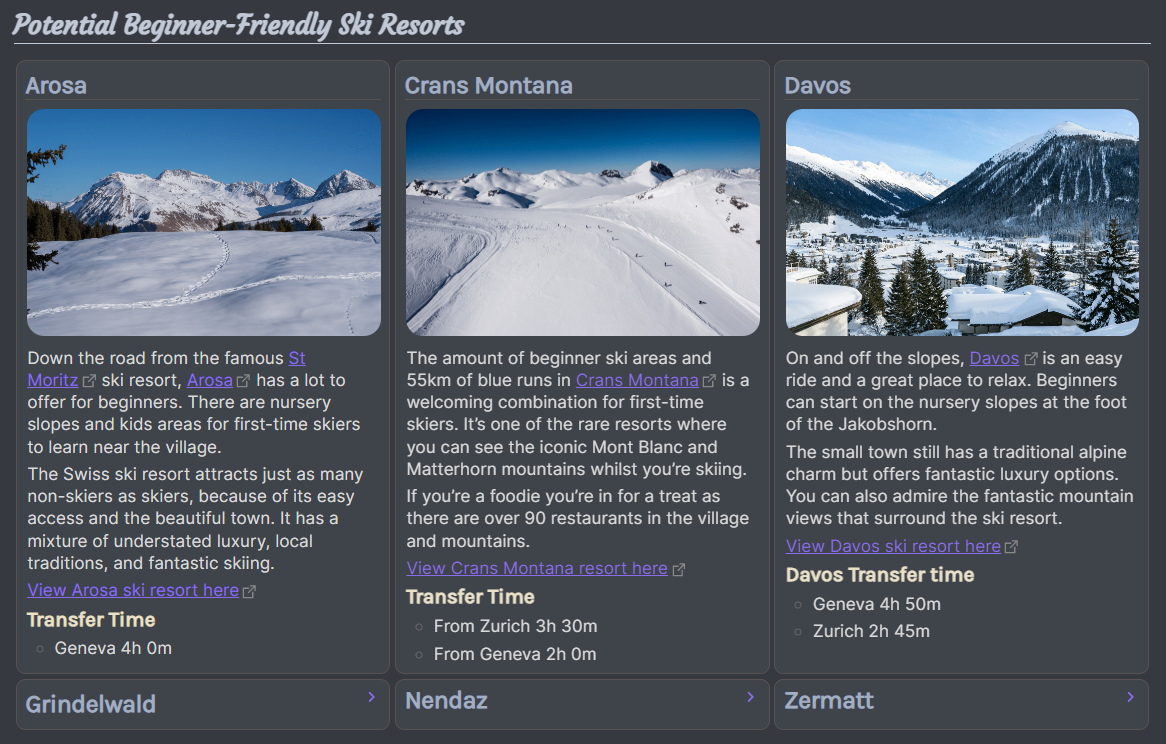
- #### Core Work #mcl/list-card
    - [[00 Home|Main Goal 1]]
    - [[00 Home|Main Goal 1]]
    - [[00 Home|Main Goal 1]]
        - Collaboration with Jane
    - [[00 Home|Main Goal 1]]
- #### Learning & System
    - [[00 Home|Learning Goal 1]]
    - [[00 Home|Initiative 1]]
    - [[00 Home|Initiative 2]]
- #### Personal
    - [[00 Home|Personal Goal 1]]
    - [[00 Home|Personal Goal 2]]
The number of cards can appear per row is subject to card’s minimum width and note’s width. Card’s minimum width is adjustable via Style Settings plugin.
List Card applies only to first level bullet
Due to some constraints, current implementation of List Card applies to first level bullet despite declaring the hashtag in the sub bullet.
Additional Controls
If you have Style Settings plugin installed, you may control the following aspects (go to Style Settings > Modular CSS Layout - Multi Column > List Grid and List Card)
- Card’s width and background Color
- Cards’ border width and border color
- Gap between card
- Bottom border for the first header in the card
Example